
Dicey.
What they do.
This fourth generation winemaking family has been instrumental in putting Central Otago on the global map for premium wine production. From the family that brought you something quite difficult, comes something a bit dicey.
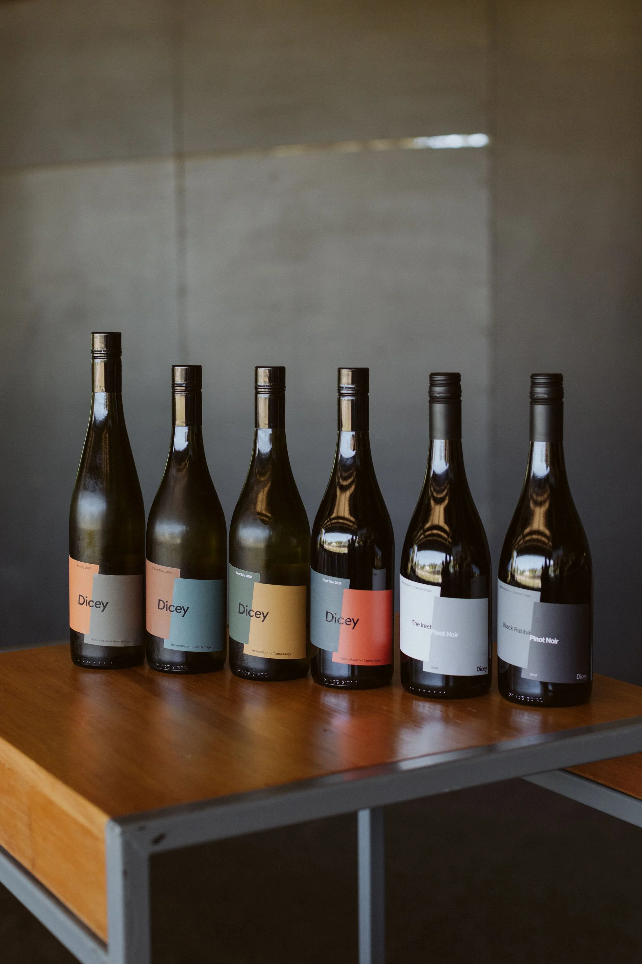
Brothers Matt & James Dicey showed courage enough to discard a brand that no longer performed in the marketplace and completely restart with a new brand name, new label and new ethos. That ethos gives Dicey the platform to be experimental and challenge the standard NZ wine making norms. This has best been revealed in their commitment to deliver the first premium NZ Pinot Noir in a bag-in-box format.

What we do.
We worked closely with brothers, Matt & James Dicey to assess the sales performance of an existing family brand. The first assignment was to help secure a trusted distributor for NZ sales. Working in conjunction with the new distributor to glean market feedback and after establishing the brand was no longer relevant for the market in which it was aiming to compete, a complete brand renovation strategy was recommended, designed and executed.
We sourced a design partner that we knew would understand the objectives of Dicey and continue to liaise on relevant brand extension projects.
Dicey was born.
We continue to work closely alongside the brothers across almost all marketing and sales aspects of the business and assisted in motivating their foray into alternative packaging by introducing the idea, assisting with design and then execution of the packaging.
GOLD PIN | Dicey — Product Category
Design Institute of New Zealand — BEST Awards 2019
Creative partners: Inhouse
Photography creatives: Tim Hawkins, Sophie Bayly & Si Moore.
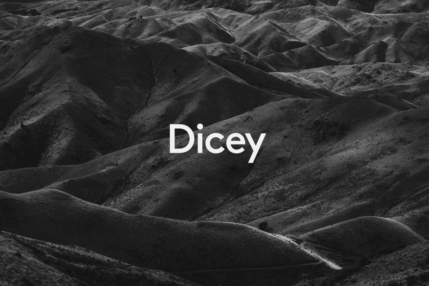
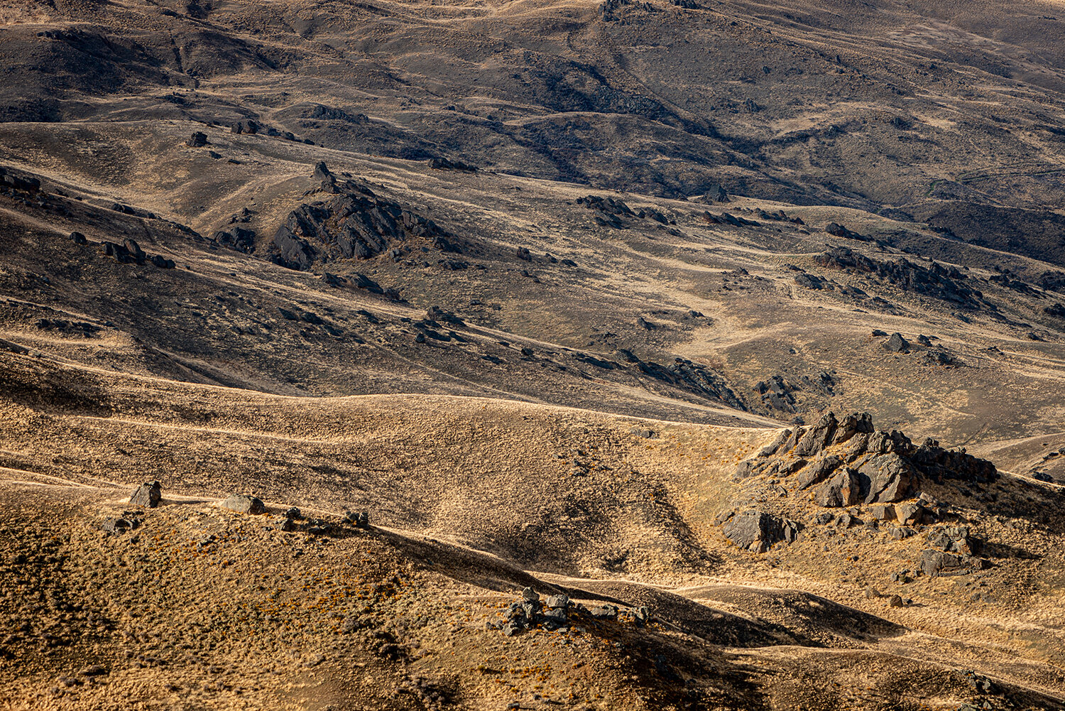
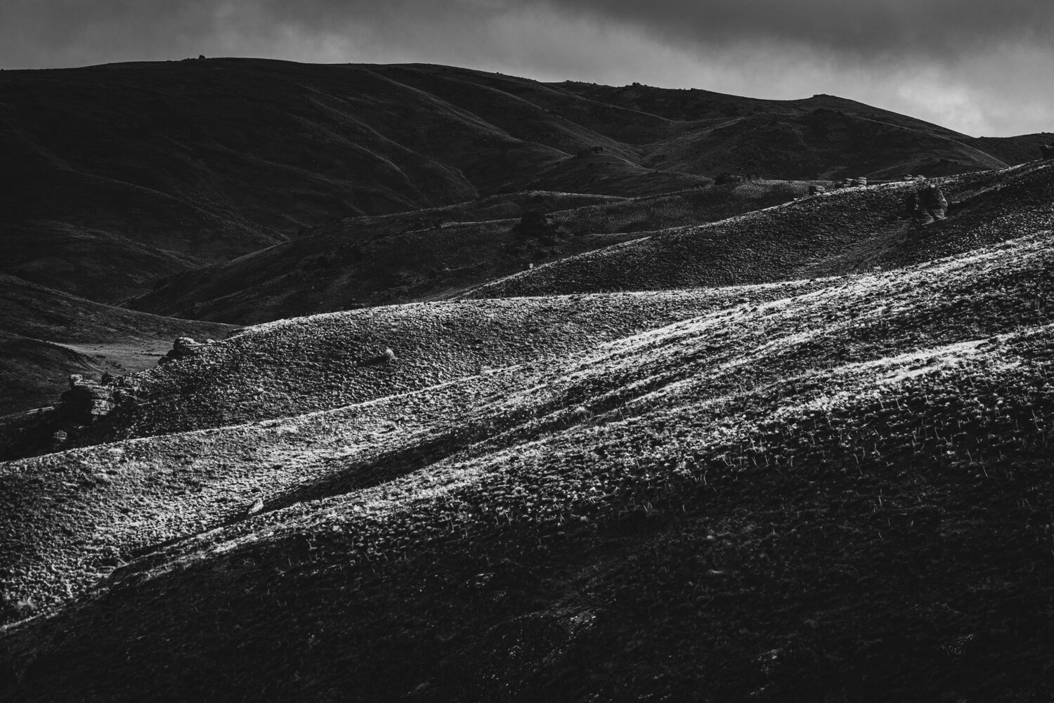
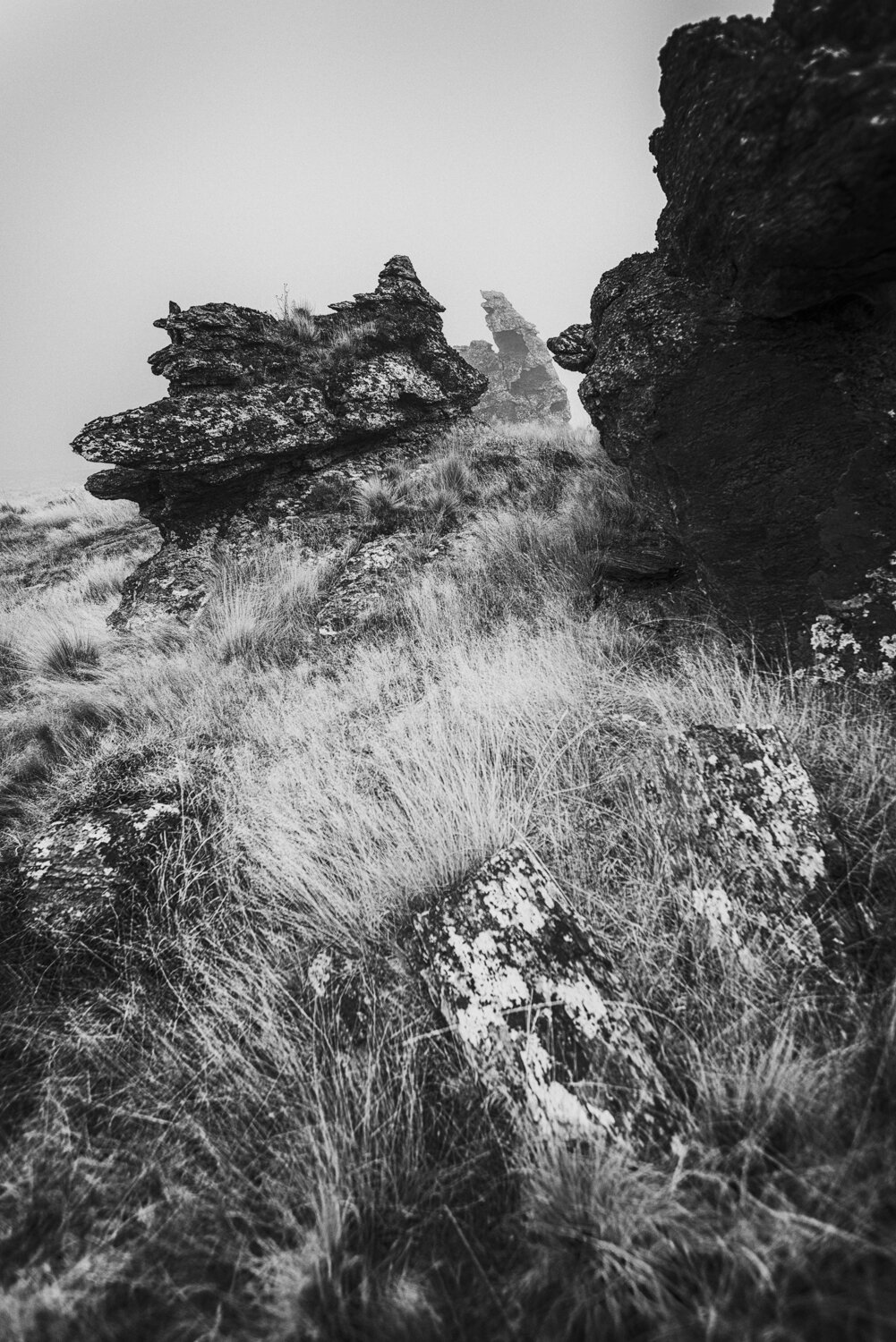
Due to the nature of both the brothers and the landscape, photography briefs pointed to exposed, high-contrast images. Vineyard photographs were removed from the brief to create curiosity and help the brand stand out from other vineyard websites. We referenced the stark and economic writing of author Annie Proulx and Cormac McCarthy as inspiration for locally-based photographer, Tim Hawkins.

On first approach, Bannockburn seems brown but it’s cut by a myriad of colours. James’ partner Odelle, an artist, took her paint brush and went wandering to capture the palette — to share what can be seen when you really know the land. These colours form part of the language of Dicey.
There is a diametrical synergy between Odelle’s soft, coloured brush strokes and the pleasing strike the landscape provides with its severity.
Arch and Toby from Inhouse used this as the basis for creating a uniquely connected portfolio of wines and that forms a colour-code of each variety.


< back